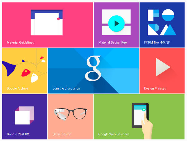
Google launched their new design guidelines somewhere middle of last year called Material Design because they wanted to come up with a new look and feel for all their apps. Since Google’s Android platform is being used in so many different devices and screens such as TVs, watches, mobile, automobiles, etc, they needed a streamlined design interface that is both intuitive, fluid yet responsive. Hence the Google Design team had to basically start from ground zero to create a better new design system.

