Google launched their new design guidelines somewhere middle of last year called Material Design because they wanted to come up with a new look and feel for all their apps. Since Google’s Android platform is being used in so many different devices and screens such as TVs, watches, mobile, automobiles, etc, they needed a streamlined design interface that is both intuitive, fluid yet responsive. Hence the Google Design team had to basically start from ground zero to create a better new design system.

Those who’ve tried out the new Android 5.0 Lollipop would definitely love the smoothness of Google’s Material Design at work. The look and feel of the user interface has improved tremendously. Users who are still using previous versions of Android may need to check whether their device are upgradable to the latest Lollipop version so they can experience the difference.

In order to create a better design system, Google’s design team pretended to work for different brands to come up with a new material design look and feel for their sites – just to make sure that they can get it right and to show that the design system is expendable for 3rd parties. Users will notice the new Tumblr site has not only been redesigned but that its app works, looks and feels better on mobile as a material design app.
Designers will need to learn the new material design system in order to design apps for 3rd party users. The demand for material design apps will increase as companies want to ride on the latest design language that will allow their sites and apps to run and integrate smoothly in both Android and iOS with the rise in consumer mobile usage.

Remember when Microsoft launched Windows 8 and Apple released iOS 7 changing the look of their interface to flat design? So in short, Google’s Material Design may look like the continuation of flat design but based on their design principle, they are actually looking to nature to create designs with meaning instead of incorporating design from man-made objects. They want users to easily identify and connect with not just the design layout but the way it functions in a more natural manner.
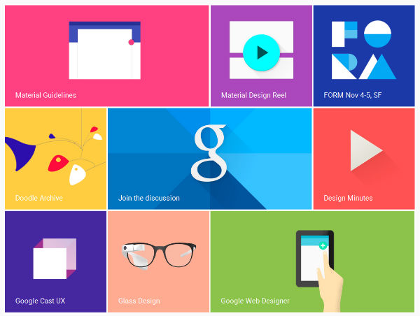
Colors are now more bold along with the fonts. You’ll notice the contrast and the fact that the interface is now more consistent, fluid and responsive when viewed on different devices.
Check out the short intro video on Google Material Design to see what I mean :
Recent Posts:
- Get A Custom Designed Website + Branding Solution With InstanteStore – From Concept To Creation
- Why Aesthetic Visuals Matter on Your Website and Social Media.
- How InstanteStore Helped Sagiri Dayal Launched A Successful Online Store With Immediate Sales
- SCAM ALERT – Fake Company Asking People To Send Them Money For Tasks
- How To Setup Stripe Account For Ecommerce
