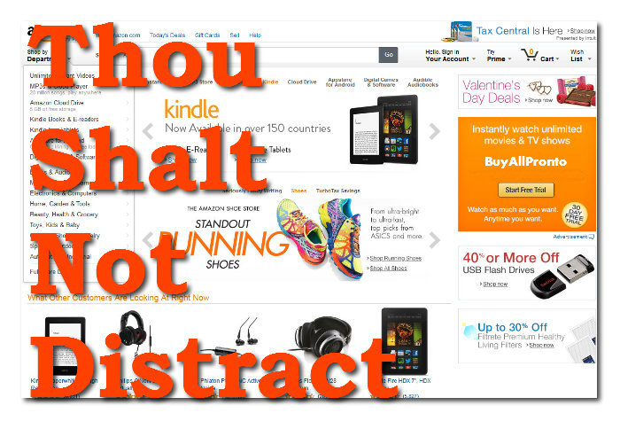
Many merchants try to make their stores look and work like Amazon or a competitor’s site without knowing exactly why those sites look and function the way they do. Copying a look or function without knowing the purpose of it could just be a waste of resources. Having a function just because it looks cool may not necessarily result in more sales.
Amazon, for instance, looks and functions the way it does because of a few reasons.
The Thing Is: Amazon Sells Everything, You Probably Don’t…But That’s A Good Thing
Amazon sells millions and millions of products every year even though their product pages are not exactly easy on the eyes. This is due to the fact that their pages are not specifically designed to cater to a specific niche so compromises have to be made in terms of design.
What You Can Do:
For normal online stores which cater to a specific target groups, not paying attention to design could spell disaster. But, you don’t have to lose sleep over your website’s design, you just have to do enough to make it look the part.
A simple yet functional design could do more good than a really good looking store that distracts shoppers from the ultimate objective – making a purchase.
The Thing Is: They Have A Really Powerful Tracking Algorithm
Amazon makes up for the lack of eye candy with with functionality which is constantly tweaked thanks to input from their super powerful tracking algorithm.
This algorithm tracks everything from cursor movements to the amount of time a shopper spends at a particular section of a page. It also tracks search behavior and buying patterns of shoppers.
This kind of real-time data crunching and analysis is out of reach to most ecommerce merchants. But all is not lost.
What You Can Do:
You can use the data which is already available to you from your shopping cart and combine them with tools like Auto-Responders For Abandoned Carts. Choosing to be notified when a shopper uses the Stock Availability Notification feature will help you gauge what people really want from your store. All these little snippets of data could collectively impact your store in a big way.
Making more sales is not just about getting in more traffic but also about making full use of the traffic you already have. The latter would allow you to make more money without having to spend more to acquire additional traffic.
But don’t just stop there, find out why a particular product is so popular at your store and emphasize that advantage in your advertising and promotions.
The thing Is: The Amazon Brand Is A Traffic Magnet
Amazon started out selling only books online way back in 1995. Thanks to their head start, they managed to build their brand name in a relatively blue ocean scenario.
Which is why when they later diversified into selling almost everything from A to Z, their brand was easily associated with online shopping. So much so that some shoppers used to bypass Google and do their product searches on Amazon itself.
With that kind of targeted traffic at their door step, they didn’t really need their site to look super nice. They just needed it to work really well.
What You Can Do:
Fortunately, Amazon is no longer the default site for online shoppers as other smaller stores have been scoring points on prices, customer service and so on.
Through SEO, social media, PPC, WEB 2.0 and a more determined effort in offering a better shopping experience to shoppers, smaller online stores have been able to come away with some very valuable traffic and a share of that hefty online sales pie.
Recent Posts:
- Get A Custom Designed Website + Branding Solution With InstanteStore – From Concept To Creation
- Why Aesthetic Visuals Matter on Your Website and Social Media.
- How InstanteStore Helped Sagiri Dayal Launched A Successful Online Store With Immediate Sales
- SCAM ALERT – Fake Company Asking People To Send Them Money For Tasks
- How To Setup Stripe Account For Ecommerce


