With Google announcing to change their search algorithm to include mobile friendliness as one of the ranking signals, this goes to show their shift in recognizing the importance of mobile shoppers in ecommerce.
Hint : Are you ready for the next shopping season?
As more folks use their mobile phones to surf and shop for stuff, it’s important to ensure that your site is mobile optimized with responsive design. This ensures that your site not only looks good but is able to load fast and adapt responsively to the different screen size of phones and tablets.
Having a mobile responsive layout means that only the necessary information is shown to users when they access your site with their mobile devices. That makes the page load faster as consumers want to get straight to the point with their devices.
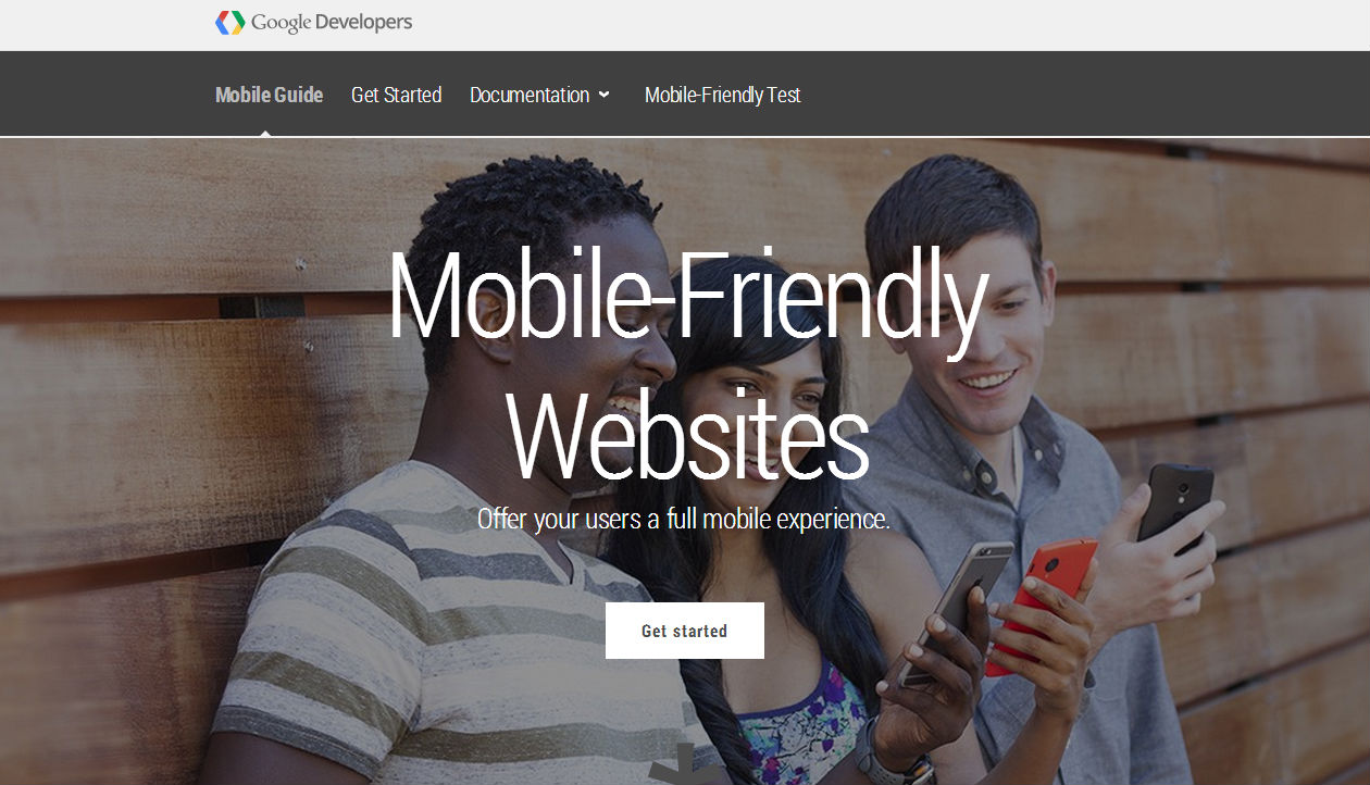
If you want to check whether your site is mobile friendly according to Google’s standard, just use their mobile friendly test by adding in your site’s URL.

The choice to change is completely up to business owners as some may prefer to maintain their current website look without wanting it to be responsive. However, for those who are interested to have a complete website design revamp, just drop us a line and we’ll be more than happy to help.
Recent Posts:
- Get A Custom Designed Website + Branding Solution With InstanteStore – From Concept To Creation
- Why Aesthetic Visuals Matter on Your Website and Social Media.
- How InstanteStore Helped Sagiri Dayal Launched A Successful Online Store With Immediate Sales
- SCAM ALERT – Fake Company Asking People To Send Them Money For Tasks
- How To Setup Stripe Account For Ecommerce
