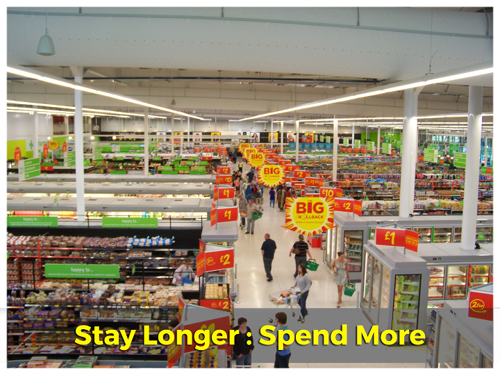
Research has shown that the more time people spend in a store, the more money we end up spending. So the goal is to get people to stay in our eCommerce shops for longer than initially intended. How do we achieve this?
Research has shown that the more time people spend in a store, the more money we end up spending. So the goal is to get people to stay in our eCommerce shops for longer than initially intended. How do we achieve this?
Most of it has to do with the design of our digital domain. Today we are tackling simple visual aspects that can make or break an online retail business: Layout, Product Images, and Positioning.
Firstly, just like physical store, a good layout is required.
Consider the physical (or is it virtual?) positioning of UI elements. It would be ill-advised to have only one search bar, but to place it at the bottom of the page would be completely futile. Utilizing our digital real estate effectively only requires that we design in a way that we ourselves interact with websites.
Amazon.com has a great layout, after years of testing we can be sure one of the biggest online stores knows what it is doing. Have a look:

The search bar is easily accessible. Right off the bat we can see it, and if needed use it. The navigation bar is simple and to the point, offering the most pertinent links. There is a full width banner displaying the current featured deal.
There are in fact TWO “Sign In” areas, one at the top navigation bar, and one located in the left column of the main stage, followed by popular categories.
Amazon has chosen not to have their home page cluttered with any specific product listings, but instead offers a wider view of available options.
Here is another store with just as well-made a layout:

Next, let’s have a look at this site:

Notice the difference? Then let’s move along post haste.
Keep the most important elements above the fold. Customers don’t want to scroll far down the page to see featured or best selling products. Imagine walking past an IT store and seeing outdated, overpriced, unpopular products on display right in front. Nobody would go in! Instead, place the Featured Products & Best-Sellers in prominent locations to help customers know what’s trending and what’s new.
How about using dynamic navigation bars? The ones that follow customers around while scrolling up or down a page. While those can be effective, it’s best to keep it minimal for best results. Once it becomes intrusive it distracts from products and brings customers out of the immersion. That’s the last thing we want!
Have a look at HyperDC WebStore for a good example of non-intrusive, non-distracting navigation bar.
Remember: just because a fancy tech is available, that doesn’t mean it needs to be used. Oftentimes, simple is sufficient. Tip the scale a little and that could mean conversions out the window.
Next: Good quality visuals are a must! That cannot be stressed enough. To keep it simple, here are 3 things to always keep in mind:
Good Product Images Focus On The Product:

Shows a clear, focused image of the product on display

A large image of the product on top, while still showing several variants within the same image

Example of an unclear product image. Could focus more on either the shoes or the shorts. Hopefully the product isn’t the turf!

BONUS: This product image is great! It features a model wearing the outfit, which will appeal to shoppers, while also showing the entire ensemble in a standalone image by the side.
Good Product Images Are High Res:

Use low resolution images and we may as well chase shoppers away with a stick!
Always Use A Standardized Background:

Finally, we also need to be aware of mobile usability.
It goes beyond responsiveness. The design should consider what elements are most important for mobile users. Mobile users are working with less real estate space. Thus, only useful information and UI elements should show up at any one time. Sizes should be large enough to target without needing the nimble fingers of a seasoned e-sports competitor.
If the majority of our audiences are shopping on mobile devices, then the design should reflect the needs of a mobile user. The checkout button should be positioned such that the majority of users will be able to tap it with only our thumb.
How about the top navigation bar? Will it be aligned left or right? Fact is, it should be large enough to target without fumbling about, and since this is mobile, it should almost always be dynamic, following the page as it is scrolled up or down. This is to ensure immediate availability when a user needs to search for something, especially if it is triggered upon seeing a similar product.
Positioning may not seem like a big deal, and most of us running ecommerce businesses don’t consider it at all, but it pays off in the long run.
Amazon again, this time on mobile:

These three visual upgrades ensure shoppers have a better, more productive shopping experience. To reiterate, more time spent = more money spent. Good layouts and quality visuals are one piece of the puzzle, and so knowing your audience inside and out will make a world of difference in increasing time spent online.
Study shopper habits and figure out how to make time spent in our specific online stores pleasurable. With analytics and tracking, nothing needs to be left a mystery. Analyze the numbers to see what’s working, change what isn’t, and it won’t be long before you start seeing higher times spent engaging with your eCommerce website.
Share personal suggestions or successes below so we can grow together!
Recent Posts:
- Get A Custom Designed Website + Branding Solution With InstanteStore – From Concept To Creation
- Why Aesthetic Visuals Matter on Your Website and Social Media.
- How InstanteStore Helped Sagiri Dayal Launched A Successful Online Store With Immediate Sales
- SCAM ALERT – Fake Company Asking People To Send Them Money For Tasks
- How To Setup Stripe Account For Ecommerce
